 Automobile and truck manufacturers are increasingly using a single LCD screen to control many in-vehicle accessories like music, GPS and climate control. The text styling on these LCD displays, as well as the buttons surrounding them, are a part of the manufacturer’s branding, just like everything else inside and outside the vehicle. This post’s title, “Can a Font Decrease Driver Distraction?” seems to have been answered as researchers have found that different fonts (typefaces) can have an impact on driver attention. More specifically, certain fonts, such as Humanist, can actually reduce driver distraction more than other fonts.
FACTS ABOUT DISTRACTED DRIVING
According to Distracted.gov, the Official U.S. Government’s Website for Distracted Driving, hosted by the National Highway Traffic Safety Administration (NHTSA), which is under the U.S. Department of Transportation (DOT), found that in 2012:
- 3,328 people were killed in crashes involving a distracted driver and an estimated additional 421,000 were injured in motor vehicle crashes involving a distracted driver;
- 18% of injury crashes were reported as distraction-affected crashes; and
- For drivers 15-19 years old involved in fatal crashes, 21% of the distracted drivers were distracted by the use of cell phones.
While the actual distraction is not known for many of these crashes, the key is distracted driving is a serious and deadly problem.
STUDYING FONT STYLE ON DRIVER DISTRACTION
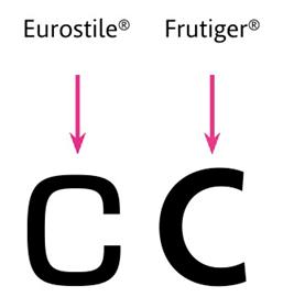
Researchers, Bryan Reimer, Bruce Mehler and Joseph F. Coughlin, presented a White Paper, An Evaluation of Typeface Design in a Text-Rich Automotive User Interface, which examined whether different typefaces (fonts) had an effect on driver distraction. The Whitepaper, which was the result of joint studies by Massachusetts Institute of Technology (MIT) AgeLab and Monotype Imaging, focused on two types of fonts, Humanist and Square Grotesque, and whether they would impact driver attention and distraction. These fonts were chosen for specific reasons. Humanist fonts, such as Frutiger, which was utilized in the study, are “considered to be more legible” while Square Grotesque typefaces, such as Eurostile, which was also used in the study, are considered less legible.
Study participants, in driving simulators, were asked to respond to a series of address, restaurant identification and content search menus that were presented in two different fonts: Frutiger or Eurostile. The researchers measured three variables when conducting the study: task response time; total glance time; and glance frequency. Two studies were conducted with the primary difference between the two was whether the level of contrast on the viewing screen made a difference as the researchers thought it may explain some of the unexpected findings when it was not a variable.
FINDINGS AND CONCLUSIONS
Significant findings of the font/driving studies include:
- There were significant differences between men and women with regard to which font was used.
- In men, there was a 10.6% reduction in visual demand measured as total glance time for the Humanist font as well as reductions in terms of total task time and number of glances.
- Males and females showed a 3.1% lower error rate with the Humanist font.
- No meaningful impact of font type in women for task response time, glance frequency or glance duration when text displayed in high contrast.
- When contrast was reduced, women showed a modest, but more similar pattern as the men in which response time and glance-frequency were improved with the Humanist typeface.
The researchers noted that their studies suggest “that optimizing typeface characteristics may be viewed as a simple and effective method of providing a significant reduction in interface demand and associated distractions.” In addition, the authors noted that other factors, such as “character size, capitalization, shadowing, rendering, and foreground/background color combinations (e.g. white on black or black on white)” may also reduce distraction. The study concluded:
In summary, this research suggests that optimizing typeface characteristics may be viewed as an effective method of providing a meaningful reduction in interface demand and associated distractions. Future work will need to assess if other font characteristics or user customization can be tuned to provide further reductions in demand.
CONCLUSION
Anything that can decrease driver distraction is important. Any increase in a driver’s reaction time increases the likelihood of being unable to avoid an upcoming hazard. If certain fonts can decrease distraction then they should be used. “Styling” should always be secondary to the prevention of crashes, injuries and death.
Lapin Law Offices hopes that the NHTSA, researchers and vehicle manufacturers, continue to look at every possible way to reduce driver distraction. A fraction of a second could mean the difference between life and death in motor vehicle crashes.
SOURCES
- Distraction.gov: Key Facts and Statistics (Internal citations omitted)
- Massachusetts Institute of Technology (MIT) AgeLab: : An Evaluation of Typeface Design in a Text-Rich Automotive User Interface
OTHER DISTRACTED DRIVING POSTS
- Going Beyond No Texting and Driving: Huron, South Dakota
- Alarming Statistics Regarding Distracted Driving
- Distracted Driving: Risks Inside Your New Car or Truck
- Drivers Understand But Often Ignore Risks of Texting or Talking on Cell Phone
- Texting Doubles a Driver’s Reaction Time According To New Study
ABOUT LAPIN LAW OFFICES
Lapin Law Offices represents victims injured by distracted drivers. You can learn more about us by calling us for a free consultation anytime (24/7) at 402-421-8033 (Lincoln), 888-525-8819 (Toll Free) or submitting your case online (Contact Us). We do not collect a fee unless we get you money.
